
This is piazza Baldaccio in Anghiari. It’s really the beating heart of the town.
There’s a market every Wednesday and countless events and festivals throughout the year. What drew me to paint this was the sense of community I feel and experience from being here, there’s always a friendly face to say hello, someone who’ll buy you a coffee or who just wants to pass some time with you.
It’s a beautiful piazza, most of the ‘borghi’ in Italy will have a piazza and a piece of sculpture dedicated to someone. The buildings are all different heights and angles, but close toned, there’s no bright colours or garish shop fronts or facades (The ‘Comune’ or council wouldn’t allow it).
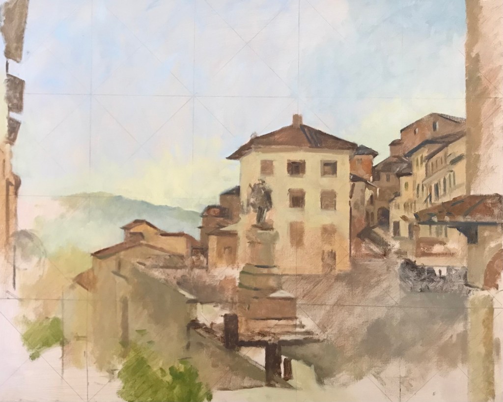
This was the first pass, ignore the lines, I’d pre-squared up the canvas to make a larger painting from studies.
It’s a fairly complex view as the town sits halfway up a hill on the edge of the Apennine ridge. I wanted to include this sense of perspective as the buildings drop down the hill to the valley floor. I started mid-morning a mackerel sky was beginning to take shape above and the sun had moved west far enough to begin. It took me three visits to get it all down, not only because it’s complex but also in part because so many people stopped to chat or buy me a coffee.
I keep the paint thin and bright to begin with. Although I am working plein air I use very little white at the early stages of a painting. I always draw in the shapes with paint, there is no pencil or charcoal drawing and then filling in.
One elderly lady wanted to know what star sign I was (it’s important for an artist apparently), I’ve no idea why and then she started using the Italian ‘past remote’, instead of saying ‘diceva’ (he or she said), she was using ‘disse’, the same but for actions in the distant past. I got lost in translation and a neighbour came to my aid as she began to speak louder and louder, the longer I didn’t understand!
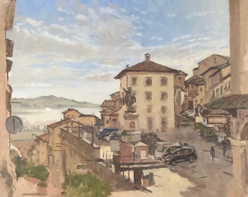
And the second sitting, where you can see the buildings taking shape that drop into the valley. It is a very steep hill, they sometimes close it in the winter if there’s snow (and use it for sledging, it must be lethal).
You can see here the colours have more harmony as I have started to introduce white, the tonal work is closer. I am still only using three primary colours, there was no need for an accent colour until later (I used a cadmium red for the sign and car lights). I use Zinc white if I need opaque colour in the mid tones or shadows as it retains the colour better than titanium (which is very opaque).
I also discovered in amongst the many interruptions that the sculpture is supposed to be directing people to Rome. And it says the same on the stone plinth inscription on which he stands. However, he is in fact pointing, north to Milan! We (the town) have had no internet for two days, apparently a tractor ploughed through the cable somewhere in ‘campagna’, the countryside. It’s hard to believe these things sometimes, but then I look at the sculpture and I am reassured that all things are possible (and sometimes remain so).
16 x 20 oil paint on Canvas. Artist’s colours Michael Harding, Windsor and Newton. Ultramarine, burnt sienna, cadmium yellow, cadmium red and the two whites, zinc and titanium.
